Garmin Connect™

Garmin Connect™

By Garmin

  • Category: Health & Fitness
  • Release Date: 2013-01-10
  • Current Version: 5.0
  • Adult Rating: 4+
  • File Size: 681.86 MB
  • Developer: Garmin
  • Compatibility: Requires iOS 15.0 or later.
Score: 4.46424
4.46424
From 44,115 Ratings

Description

The Garmin Connect™ app is your one-stop source for health and fitness data. Whether you’re training for a race, keeping active or just staying on top of your health, Garmin Connect provides the information and inspiration you need to reach your goals. Once you pair your phone(1)with a Forerunner®, Venu®, fēnix® or another compatible Garmin device(2), you can review your tracked activities and health metrics. Plus, you can create workouts, build courses and challenge your friends on the leaderboard. With Garmin Connect you can: - Personalize your home screen, so the most helpful information is instantly visible - 
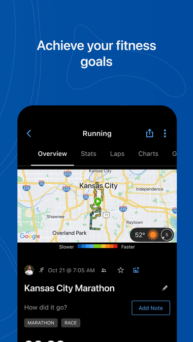
Analyze your activities with detailed statistics(3) - 
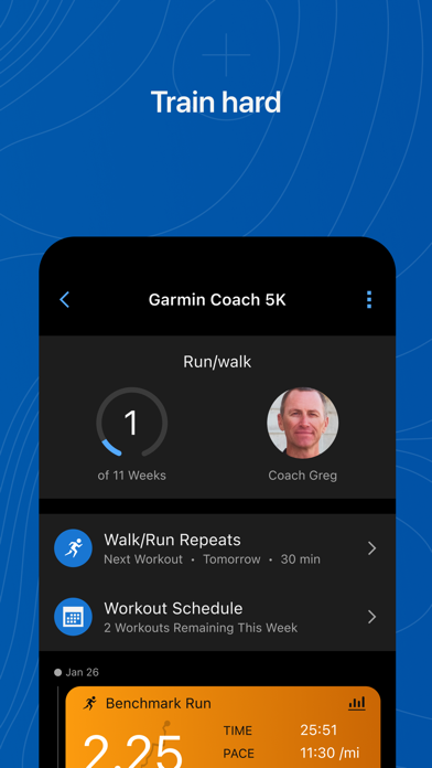
Create customized workouts and courses - 
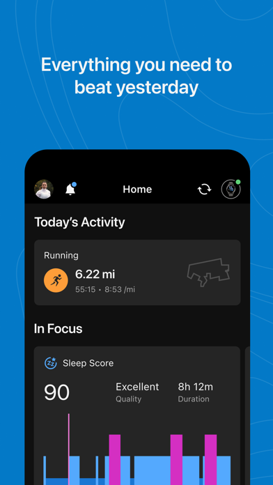
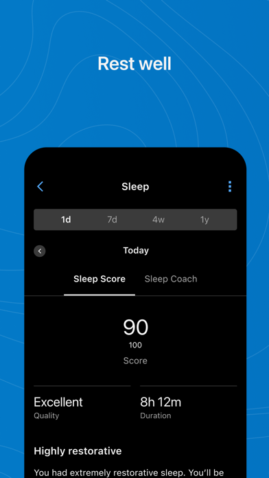
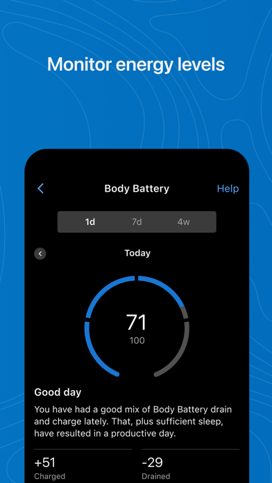
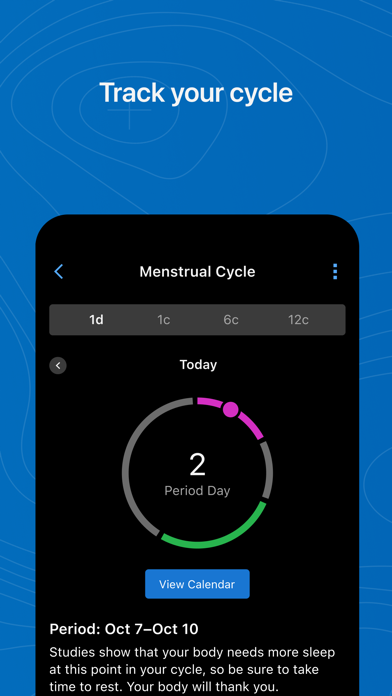
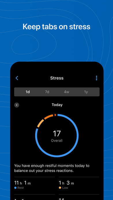
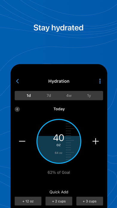
Review trends in health metrics like heart rate and steps - Earn badges for accomplishments - Sync with other apps like Apple Health, MyFitnessPal and Strava - Get support for Garmin devices and their features Learn more about Garmin devices and how they work with the Garmin Connect app at Garmin.com. (1) See compatibility requirements at Garmin.com/BLE (2) See a full list of compatible devices at Garmin.com/devices (3) See Garmin.com/ataccuracy Note: Continued use of GPS running in the background can dramatically decrease battery life.

Screenshots

Reviews

  • Don’t update

    1
    By Aziz Zakkout
    Interface was fine as it was before.
  • No Goals on home page!

    1
    By Darth Los
    The newly updated design of the home page is nice but Garmin got rid of Goals for the home page. Goals is still available but you have to look on the left hand menu of the web page to find it (near the bottom). Goals that I create for my yearly or monthly targets used to be shown on the home page but no more!!! I can’t even find Goals in the iPhone app any more! Garmin please bring Goals back to the home page! Thanks.
  • Latest update removed compact view

    2
    By J01749401
    Now it’s giant tiles and slower to review information. Terrible UI team.
  • Just change it back

    2
    By ericat0817
    New update is terrible.
  • New app interface is awful

    1
    By rakahler
    Please restore - at least as an available option - the previous app interface. The new one is not at all user friendly and limits my ability to view what I want quickly and efficiently
  • New App Home Screen is a Disaster

    1
    By Bungybungy
    The organization and limitations on the data you can access at once on the new Home Screen is atrocious. They are looking to solve a problem that didn’t exist. Instead of being able to scroll through stats and data the Home Screen is now dotted with widgets which don’t provide a pleasant viewing experience (not everything needs to be a widget).
  • New update

    1
    By AuggieMeow
    New update is horrible. Have to swipe and click to see data. It was so much better before.
  • New 5.0 Confuses

    1
    By Scooter68537931
    New 5.0 is less user friendly than the previous. This update made my screen even more confusing to read. The old one with single horizontal data bars was much better as it didn’t overload a person’s visual input. Give users a choice to go back with the old or stay with the update!
  • New layout

    2
    By sachUW
    The new layout is awful, i have lost the ability to easily track some metrics like hydration. The sliding cards are clunky when the data used to be front and center. Please just give us back the old one. I don’t want to see graphs on my dashboard, they take up too much space.
  • Was the best, now the WORST time-wasting app.

    1
    By Smithandwesson21
    On 4/25/24, Garmin forced an updated version of the Garmin Connect app to my iPhone that I did not want. The Home Screen is no longer customizable. They made the cards larger in size and vertical in shape. Each card now contains a lot of wasted space and consumes too much valuable space on my iPhone screen. And I can no longer edit the Home Screen to move the cards that I view most often to the top of the screen. And in the new version, they decided to separate the cards into sections and they are wasting valuable screen real estate with large headings for each section. To access the cards that I use requires a lot of scrolling. Since I have a busy life and I use the app to view my data on the move, this is a dealbreaker. Excessive scrolling is very hard on my basal joint arthritis, not to mention difficult to do while actively exercising, especially with glare from the bright sunlight. They made this app so difficult to use that I am considering switching to a new wearable from a different manufacturer. The data that used to take a couple seconds to access now takes 10 times as long to see. If you are a user who likes to see a lot of margins and blank space on your screen and loves to scroll, then this new version was designed for you. If you are a user who has a busy life and doesn’t have time for scrolling and who actually uses the app to see your data and wants to look at it quickly and move on to your activity, then you might want to chose a different manufacturer.

keyboard_arrow_up